


The Paradox of Choice: How to Simplify User Decisions to Boost Conversions
Stop overwhelming your customers: The counterintuitive path to higher ROI

Hey there!
I'm Akshay,👋 and I'm thrilled to see you all here again.
Last month, we took a nostalgic trip back to the 90s with "The Tamagotchi Principle: How 90s Toys Can Teach Us About User Engagement." The response was phenomenal! So many of you shared how this principle resonated with your current work, proving that sometimes, the most valuable insights come from unexpected places. It's amazing to see how a simple digital pet from decades ago can still inform our approach to user engagement today.
Riding on that wave of enthusiasm, this month I’m tackling another counterintuitive concept. Get ready to challenge your assumptions about product development and why more choices don't always lead to better outcomes🤔
What You'll Learn Today:
🧠 The psychology behind the Paradox of Choice
📊 How choice overload impacts user experience and conversion rates
💡 Practical strategies to simplify user decisions
🏆 Success stories from Apple, Netflix, and Amazon


But first: Imagine, you're standing in front of your fridge, hungry after a long day at work. You open the door, hoping for a quick and satisfying meal. But instead of relief, you feel a wave of indecision wash over you.
There's leftover pizza from last night, a container of your mom's homemade soup, ingredients for a fresh salad, and that packet of instant noodles you bought "just in case." Each option seems fine, but which one is the right choice?
You pick up the pizza box, then set it back down. Maybe the soup would be healthier? But the salad might be the quickest. The noodles would be delicious.
Minutes tick by. Your stomach growls, but you're paralyzed by the options. Finally, feeling frustrated and still hungry, you grab a snack bar from the cupboard and flop onto the couch.
Welcome to the Paradox of Choice.🎭
Now that we've set the stage, let's dive into the origin of the Paradox of Choice and its historical context.
How I Stumbled Upon the "Too Much Choice" Problem
Last week, I was trying to pick a new podcast on Spotify and I found myself completely stuck. There were just so many options! 😵
So, I started googling "How to make faster yet effective decisions?" And that's when I discovered this fascinating jam experiment from the late '90s.
Here’s what I found out:
A study was conducted in a California grocery store about customer behavior when presented with different numbers of choices. The researchers set up a jam-tasting booth that alternated between two setups:
A large display with 24 different jam flavors
A small display with only 6 jam flavors
The results were interesting:
More people stopped to look at the large display with 24 jams
However, the small display with 6 jams resulted in 10 times more actual purchases
This experiment showed that while more options might attract attention, fewer choices can lead to more decisive action from customers.
This got me thinking about all the times I've felt overwhelmed by choices. Remember when Netflix had like 20 shows and we always knew what to watch? Now we spend half our evening just scrolling!📺

It turns out smart folks have been thinking about this "too many choices" problem for a while:
In the 1950s, Herbert Simon noticed we often pick what's "good enough" instead of searching endlessly for the perfect option.
Later, in the 1970s, researchers Kahneman and Tversky found that we worry more about avoiding bad outcomes than chasing great ones.
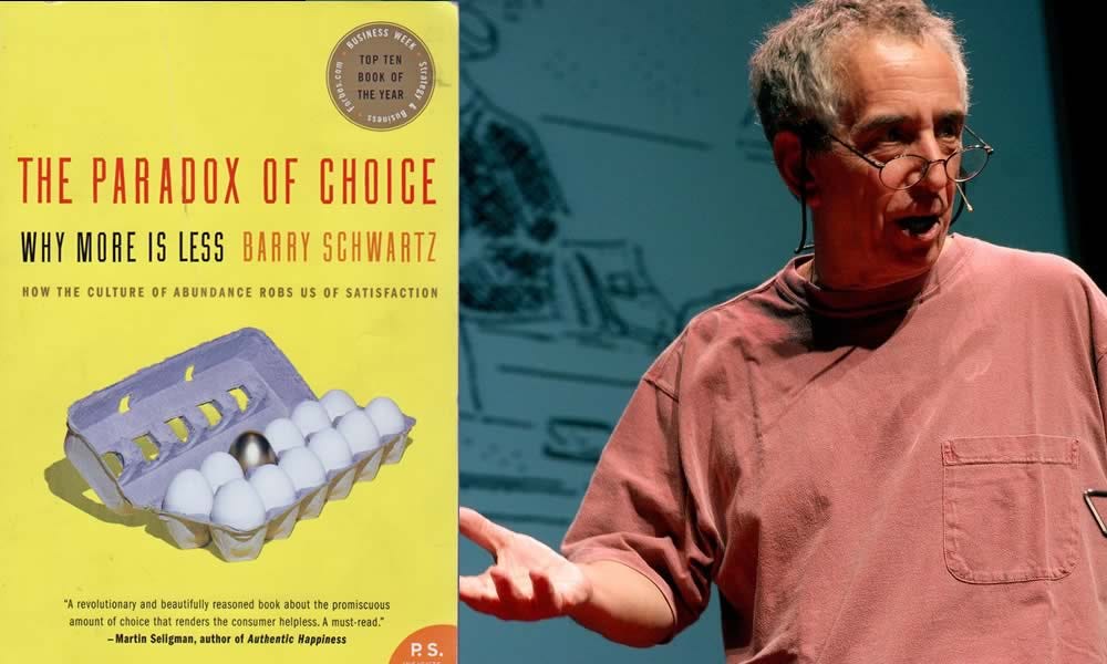
By 2004, this idea was so important that Barry Schwartz wrote an entire book called "The Paradox of Choice."
So next time you feel stuck trying to choose between tons of options – like picking from a wall of toothpaste – remember, it's not just you. Lots of people find this tricky!
Now, let's explore the psychological mechanisms that make too many choices overwhelming.
Why Our Brains Short-Circuit: The Psychology of Overwhelm🧠
So why does too much choice paralyze us? Let's break it down:

Imagine these forces at work in the digital world!
Let’s take an e-commerce example:
A visitor lands on your e-commerce site, faced with thousands of products. Each click brings more options, more decisions. Their cognitive load increases, anxiety builds, and suddenly... they're gone. Back to Instagram for some mindless scrolling (as discussed in the above image - our brain have limits, beyond that limit it stops functioning at its best)📱
This scenario illustrates the Paradox of Choice in action, but it's only part of the story. While too many choices can overwhelm users, too few options can lead to dissatisfaction and lost opportunities. Let's explore this balance using a familiar example: Netflix.
The Netflix Balancing Act

The Early Days: Remember when Netflix had a limited library? It was easier to choose, but the lack of variety left many users wanting more.
Content Explosion: As Netflix expanded its catalog, users gained access to a wealth of content. This variety became a key selling point, improving user retention and monetization.
The Overwhelm: However, with thousands of titles, many users found themselves endlessly scrolling, unable to decide what to watch.
The Solution: Netflix's "Top 10" lists and personalized recommendations. These curated choices simplify decision-making while still offering the benefits of a vast library.
Applying This to E-commerce and Product Design
By striking this balance, you can offer the benefits of choice while mitigating its potential downsides. It's not about having fewer options overall, but about presenting them in a way that empowers rather than overwhelms your users.
This nuanced approach to the Paradox of Choice can significantly impact user experience and, ultimately, your bottom line. 💸
Now that we understand the psychology, let's translate this into tangible business impacts.
From Theory to Practice: How Choice Overload Impacts Your Bottom Line
Decreased Engagement: Overwhelmed users interact less. Walmart.com experienced this firsthand:
Initially, their landing page was cluttered with numerous product categories, special offers, and featured items.
They noticed that despite high traffic, user engagement (clicks, time on site, conversion rates) was lower than expected.
In response, Walmart simplified their landing page by:
Reducing the number of featured product categories
Streamlining the navigation menu
Focusing on a few key promotional areas instead of many
The result? A 20% increase in engagement metrics, including:
More clicks on product categories
Longer average session duration
Higher conversion rates from homepage to product pages
This real-world example demonstrates how reducing choices can actually encourage users to engage more deeply with a website or app.
Lower Conversion Rates: Remember the jam study? A 27% decrease in purchases with more options.
Increased Decision Time: A study by Löfgren et al. (2013) found participants took 87% longer to decide when faced with 18 options vs. 6 options.
Reduced Customer Satisfaction: Paradoxically, more pre-purchase options often lead to less post-purchase satisfaction.
Higher Cart Abandonment: In e-commerce, complex product pages or checkout processes lead to abandoned carts. 21% of US online shoppers have ditched orders due to a "too long/complicated checkout process."
The message is clear: simplify or watch your conversions plummet.
With all this information about choice overload and its impact on user behavior, we need a framework to help us design the best, most optimal experience. How can we cut through the complexity and create interfaces that guide users to the right choices without overwhelming them?
Personally, I've found the Jobs To Be Done (JTBD) framework to be incredibly powerful in this regard. It's a lens that has transformed how I approach product design and user experience, helping me strip away unnecessary options and focus on what truly matters to users.
What is “Jobs To Be Done”?
The JTBD framework focuses on the underlying motivations and goals that drive customers to "hire" a product or service. Instead of thinking about product features or user demographics, JTBD encourages us to consider:
What task is the user trying to accomplish?
What are the circumstances surrounding this task?
What are the emotional and functional outcomes the user is seeking?
By understanding these core "jobs," we can design experiences that align perfectly with user needs, naturally simplifying the decision-making process.
How JTBD Simplifies User Experiences
Focuses on Core Needs: By identifying the main "job" users are trying to accomplish, we can eliminate irrelevant options and features.
Contextualizes Choices: Understanding the circumstances of use helps us present the right options at the right time.
Aligns with User Goals: By focusing on desired outcomes, we can structure choices in a way that resonates with users' motivations.
Let's explore how some successful companies have applied JTBD principles to simplify user experiences and drive conversions:
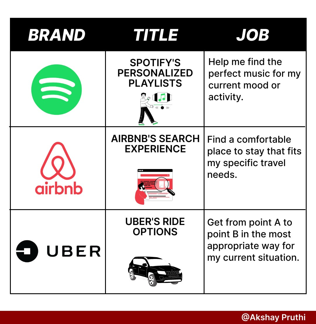
Example 1: Spotify's Personalized Playlists
The Job: "Help me find the perfect music for my current mood or activity."
How Spotify Simplifies:
Instead of overwhelming users with millions of tracks, Spotify creates curated playlists like "Discover Weekly" and "Daily Mix."
These playlists are personalized based on listening history and time of day, reducing the need for users to search and choose individual songs.
Result: Users spend less time deciding and more time enjoying music, leading to increased engagement and satisfaction.
Example 2: Airbnb's Search Experience
The Job: "Find a comfortable place to stay that fits my specific travel needs."
How Airbnb Simplifies:
Rather than presenting an endless list of properties, Airbnb uses filters and categories aligned with common "jobs" (e.g., "Work-friendly stays," "Unique homes").
Their search algorithm prioritizes listings that match the user's implicit needs based on past bookings and browsing behavior.
Result: Users can quickly find relevant options without sifting through irrelevant choices, increasing booking rates.
Example 3: Uber's Ride Options
The Job: "Get from point A to point B in the most appropriate way for my current situation."
How Uber Simplifies:
Instead of showing all possible car types and services, Uber presents a simplified set of options (e.g., UberX, Uber Black, Uber Pool) based on the user's location and typical usage.
Each option clearly communicates its main benefit (economy, luxury, or cost-sharing), aligning with different user "jobs."
Result: Users can quickly choose the right service for their needs, leading to faster bookings and higher satisfaction.
Now, how do we apply this to your product? Let's explore...
Applying JTBD to Your Product
Applying the Jobs-to-be-Done (JTBD) framework to your product can revolutionize your approach to user experience and product development.
When you focus on the core tasks your customers aim to accomplish, rather than just product features, you can create a more intuitive and valuable solution.
This customer-centric methodology helps you streamline your product, reduce complexity, and ultimately deliver a more satisfying experience that truly resonates with your users' needs and goals.
To leverage the JTBD framework and simplify your user experience:
Identify Core Jobs: Conduct user research to understand the primary tasks your customers are trying to accomplish.
Map the Decision Journey: For each core job, outline the steps users take and the information they need at each stage.
Streamline Options: Present choices that directly align with identified jobs, eliminating irrelevant options.
Contextualize Decisions: Use user data and behavior patterns to present the most relevant options first.
Communicate Value Clearly: Ensure each option's benefits are clearly tied to the user's desired outcomes.
Test and Iterate: Continuously gather user feedback and behavior data to refine your approach.
By applying the JTBD framework, you're not just reducing options – you're aligning your entire user experience with your customers' true needs and motivations.
This approach naturally simplifies decision-making, leading to faster conversions, higher satisfaction, and long-term customer loyalty.
Remember, the goal isn't to limit choices arbitrarily, but to present options in a way that feels tailored and intuitive to each user's specific "job to be done."
As we conclude our deep dive into the Paradox of Choice, remember this: your job as a UX designer, marketer, or product manager isn't to provide endless options. It's to provide the right options, at the right time, to the right user.
So, the next time you're tempted to add "just one more option," pause. Ask yourself: Am I adding value, or just noise? Am I empowering my users, or overwhelming them?
Remember, in the land of user experience, less isn't just more. Less is everything.
Until next time, keep it simple!💡
Akshay.
P.S. Have you experienced the power of simplification in your products? Or perhaps you're grappling with a choice overload challenge? Hit reply and let's discuss. Your story could be featured in our next newsletter!