


Why Some Features ‘Wow’ While Others Flop?
Here’s Your Feature Playbook

Hi all!
Have you ever wondered why some features you thought were game-changing barely move the needle with customers? Or why the simple, almost invisible ones - like Uber showing the driver’s ETA - make your product indispensable?🤔
Here’s a hard truth: 80% of product features go rarely used or completely unused. Yes, eighty percent🤯Imagine pouring months of development and millions of dollars into features that users don’t care about.
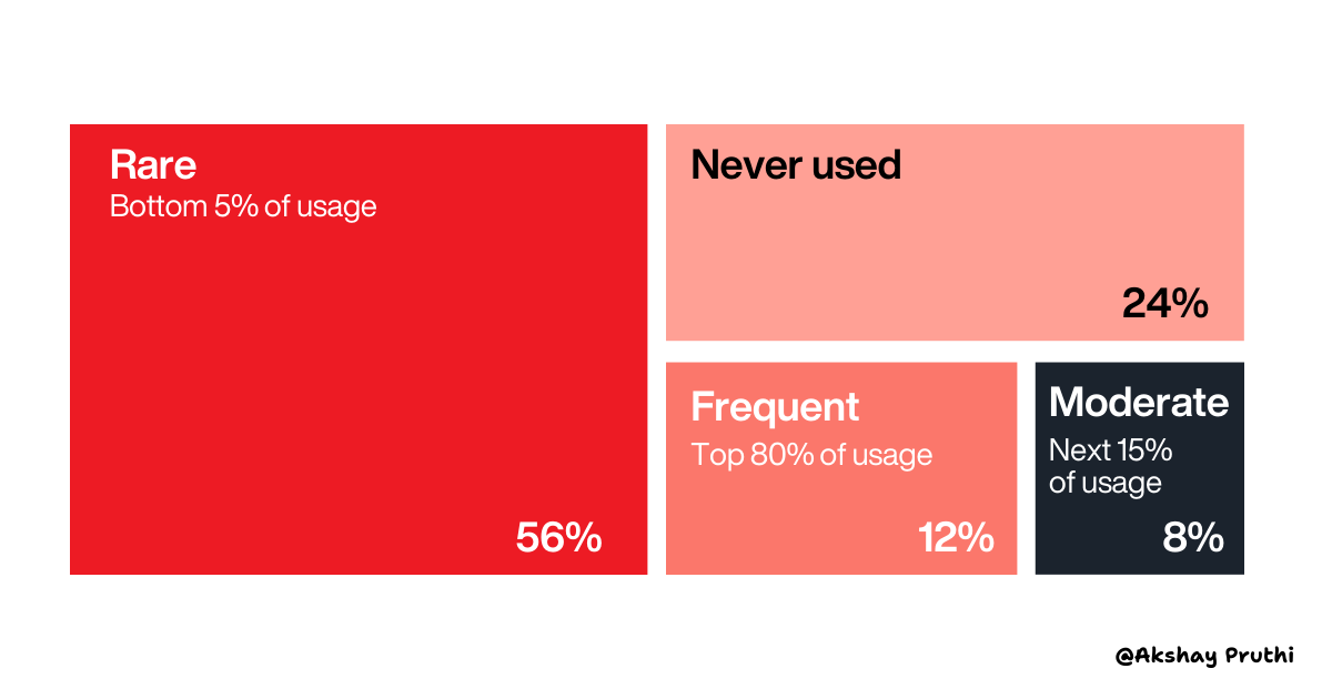
Credit: Pendo 2019 Feature Adoption Report
But why does this happen? Because not all features impact customer satisfaction the same way. Some solve pain points your users can’t live without, while others are resource traps, quietly eating away at your budget and focus.
Take this example: when Netflix launched autoplay previews in 2016, it wasn’t something users were asking for. In fact, many initially found it annoying. But here’s the twist - Netflix discovered it reduced browsing time by 20%, boosted content sampling by 27%, and kept people on the platform longer. It wasn’t a “nice-to-have” - it solved a problem users didn’t even realize they had.
I have discussed more such case studies in this newsletter!
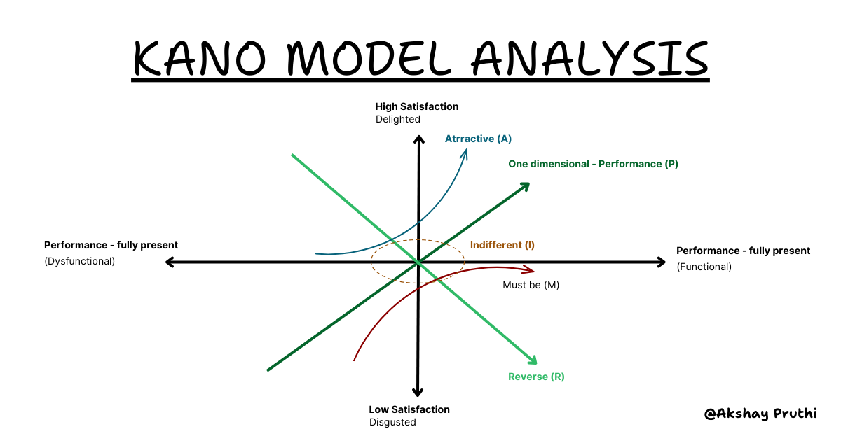
This is the magic of the Kano Model.
I’ll admit, I’m usually not a fan of models - they often feel too theoretical and detached from real-world chaos. But this model is different. It’s simple, actionable, and surprisingly intuitive when you’re trying to understand user preferences.
It helps you predict:
Which features will wow your users.
Which will frustrate them.
And, crucially, which aren’t worth your time.
The best part? It forces you to think beyond just functionality. It’s not just about solving problems, it’s about creating delight. For me, applying this framework has turned “feature prioritization” into a more thoughtful (and way less frustrating) process.
So, how do you make sure you’re building features that matter? Let’s break down the Kano Model and uncover its playbook for prioritizing the right features.
What You’ll Learn in This Newsletter📝
Understanding Kano Model for your product
The four types of features that define customer satisfaction (and dissatisfaction).
How to identify, evaluate, and prioritize features that matter.
Real-world examples of companies that nailed or failed each category.
A step-by-step framework to apply the Kano Model to your product roadmap.
Let’s dive in!
Even with Millions of $$$ Poured In, Customer Satisfaction Stayed at Zero. Here’s Why:
In the 1980s, Japanese giants like Toyota and Sony were leading innovation, yet faced a challenge: why wasn’t customer satisfaction matching their advancements?
Companies poured millions into new features, but users often seemed indifferent. Traditional quality models assumed “better quality” always meant “happier customers,” but reality proved otherwise🔁
Development costs soared, and customer feedback revealed contradictions - like some features, despite being expensive and sophisticated, went completely unnoticed.
This was the messy, unpredictable reality that Professor Noriaki Kano set out to untangle. Through years of research especially in industries like automotive and consumer electronics - he discovered something groundbreaking:
Not all features are created equal, and their impact on satisfaction isn’t linear.
That insight became the foundation of the Kano Model, a framework that helps us understand which features matter most and why.
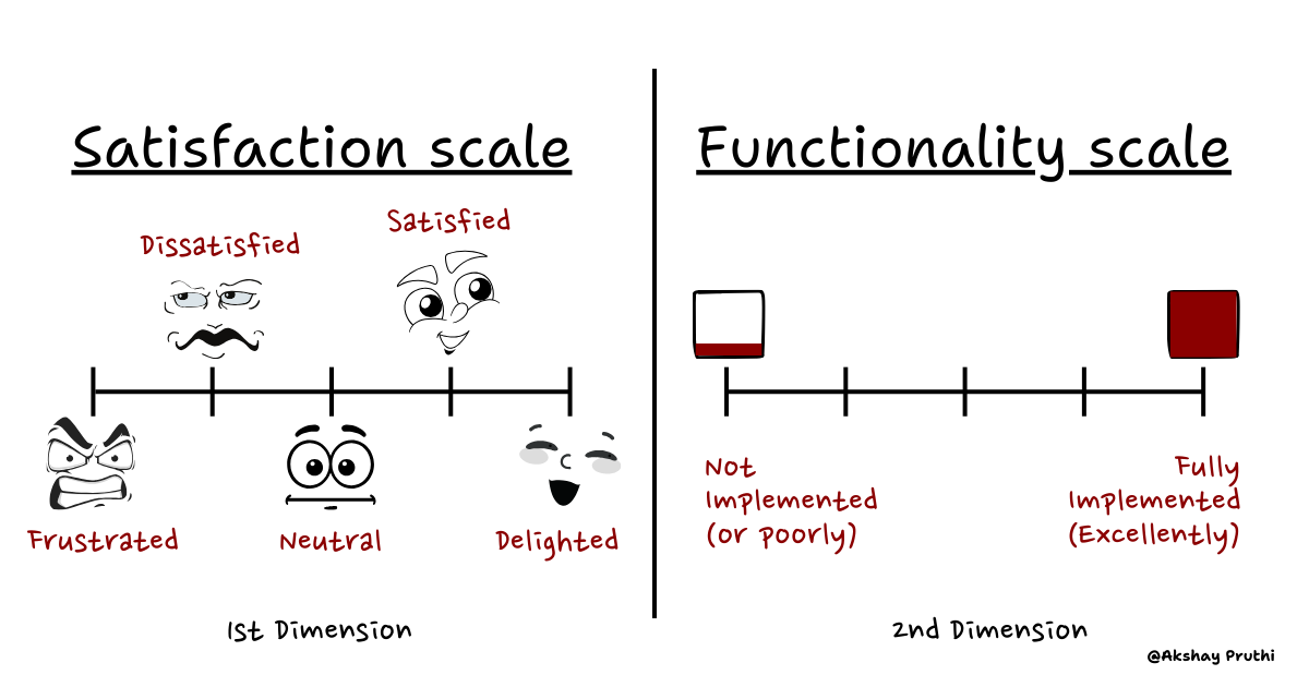
Understanding the Four Dimensions of Customer Satisfaction
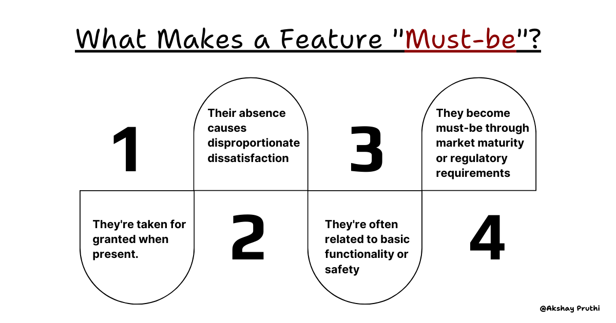
1. Must-be Features: The Silent Guardians of User Trust🤫
Imagine walking into a restaurant. You don't praise the cleanliness of the plates, you expect it. But a dirty plate? That's an instant deal-breaker. In psychology, there's a concept called "hygiene factors" – elements that don't contribute to satisfaction when present but cause dissatisfaction when absent. Must-be features operate on the same principle.
But what happens when a Must-be feature fails catastrophically? Let’s look at a case study that illustrates the devastating consequences of breaking this fundamental trust.
The Toyota Crisis: A Must-be Nightmare Unfolds
In late 2009, Toyota faced its darkest hour. The accelerator pedals in several models were sticking, leading to unintended acceleration. This wasn't just a technical failure; it was a breach of the most fundamental must-be feature: safety.

Read an article here: https://www.nytimes.com/2010/03/04/business/04toyota.html
The aftermath was devastating:
$2 billion in lost sales wasn't even the worst part
Toyota's market share plummeted by 9% in a matter of months
Customer trust, built over decades, evaporated overnight
9.1 million vehicles recalled globally
Congressional hearings and a $1.2 billion settlement
The recovery strategy became a masterclass in rebuilding must-be features:
Complete redesign of quality control processes
Implementation of the SMART system (Swift Market Analysis Response Team)
Introduction of brake override technology
Creation of the External Safety Advisory Panel
By 2014, Toyota had not only recovered but emerged stronger, with new quality control processes that would influence the entire automotive industry.
Now that we’ve discussed the non-negotiable nature of Must-be features, let’s shift gears and explore the features that drive satisfaction directly.
2. One-dimensional Features: The Performance Players🎯
In the early 1990s, processor manufacturer Intel faced an interesting challenge. Their research showed that while users demanded faster processors, the satisfaction gained from speed improvements wasn't consistent across all user segments. This highlighted a fundamental aspect of one-dimensional features: their impact varies based on user context and usage patterns.
The psychology behind One-dimensional features is fascinating, they play directly into how we perceive improvements. Let’s take a closer look.
Three psychological principles govern one-dimensional features:
Weber's Law of Just Noticeable Difference
Users need a minimum 10% improvement to perceive performance changes
This threshold increases as baseline performance improves
Example: A 1-second improvement in load time is more noticeable when going from 5 to 4 seconds than from 50 to 49 seconds
Prospect Theory in Feature Performance
Users value performance losses more than equivalent gains
The pain of performance degradation is roughly 2.5 times stronger than the pleasure of improvement
This explains why performance regressions are particularly damaging to user satisfaction
Anchoring Effect in Performance Expectations
First experiences set performance benchmarks
Competitors' performance levels create reference points
Industry standards become psychological anchors
So, to illustrate how One-dimensional features can transform an industry, let’s examine how Amazon redefined retail with delivery speed.
Amazon Prime: The Delivery Revolution
When Amazon launched Prime in 2005, they didn't just improve delivery, they rewrote the rules of retail. Here's the fascinating progression:
2005: Launch of Prime with 5-7 day shipping
Initial skepticism from retail experts
$79 annual fee considered "ambitious"
1 million items eligible for Prime
2009: Two-day shipping introduction
Prime membership grows to 2 million
Customer satisfaction scores increase by 43%
Average Prime member spending increases from $400 to $900 annually
2019: One-day shipping rollout
$800 million investment in Q2 2019
150 million Prime members globally
Average Prime member spending reaches $1,400 annually

Each improvement in delivery speed showed a directly proportional increase in customer satisfaction and spending. But the story gets more interesting. Amazon discovered that faster delivery didn't just satisfy customers - it changed their shopping behavior entirely.
But here’s the kicker: after a point, the returns start to diminish. Would reducing delivery time to two hours delight all users, or would it only cater to a niche segment?
As we consider diminishing returns, let’s move to features that create pure joy - the Attractive features.
3. Attractive Features: The Joy Creators🤩
January 9, 2007. Macworld Conference, San Francisco. Steve Jobs is about to demonstrate something that would change how we interact with technology forever. As he pinches and zooms on the first iPhone's screen, the audience gasps. Nobody had asked for this feature. Nobody even imagined it was possible. Yet in that moment, it became something everyone would soon want.
This is the magic of attractive features – they solve problems we didn't know we had. But what makes them truly fascinating is how they interact with our brain's reward system. When we encounter an unexpected positive experience, our brains release more dopamine than they do for anticipated rewards. It's why finding a $20 bill in an old jacket feels more exciting than receiving the same amount as planned.
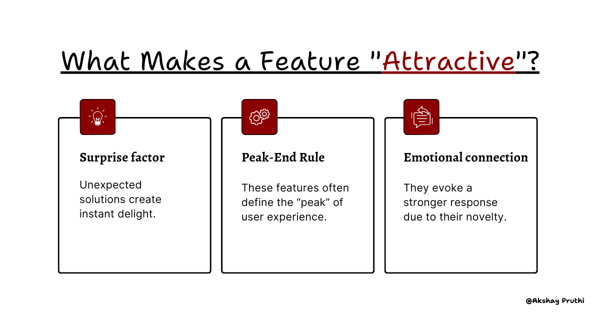
But not all Attractive features are created equal. Their impact depends on how well they tap into unspoken user needs. Netflix nailed this with a feature that changed the streaming experience forever.
The Netflix Revolution: How Auto-Play Preview Changed Streaming Forever
In 2016, Netflix faced a curious problem: Users were spending an average of 90 seconds deciding what to watch, often abandoning the platform altogether. The solution they devised would become one of the most influential attractive features in streaming history.
The Auto-Play Preview Journey:
Initial Concept (2015)
Internal debate: Would auto-playing trailers annoy users?
Small-scale test with 2,000 users
Surprising result: 20% reduction in browsing time
Implementation (2016)
Rolled out to 50% of users
Key metrics:
32% faster content discovery
27% increase in content sampling
15% reduction in platform abandonment
Evolution (2017-2019)
Machine learning integration for personalized previews
A/B testing revealed:
41% higher series completion rate
35% increase in cross-genre exploration
23% more viewing time per session
Industry Impact
Adopted by Amazon Prime, Disney+, and HBO Max
Created a new standard in streaming UX
Influenced content creation (shows now designed with auto-preview in mind)
As impactful as Attractive features are, they have a short half-life. What wows today might become expected tomorrow.
Speaking of features that fall short of delight, let’s examine the silent killers of product efficiency: Indifferent feature
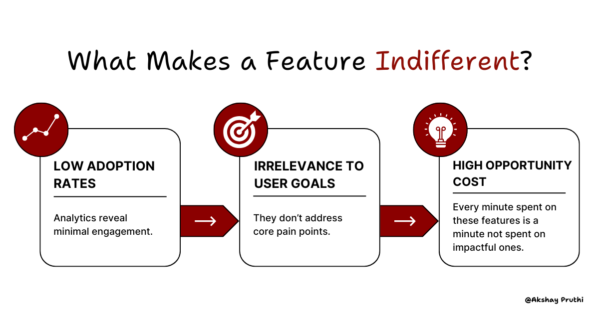
4. Indifferent Features: The Resource Traps🪤
The most dangerous features aren’t the ones that fail outright, they’re the ones that quietly drain your resources without adding value. These features don’t just fail to delight users; they actively undermine your product’s efficiency and clarity by diverting time, effort, and money away from impactful initiatives.
Microsoft Word is a classic example of how feature bloat can overwhelm users and drain resources.
The Ribbon Interface: A Bold Attempt at Simplification
Faced with mounting evidence of feature bloat, Microsoft made a revolutionary move with the release of Office 2007: they introduced the Ribbon interface, a visual overhaul designed to streamline feature access and improve usability.
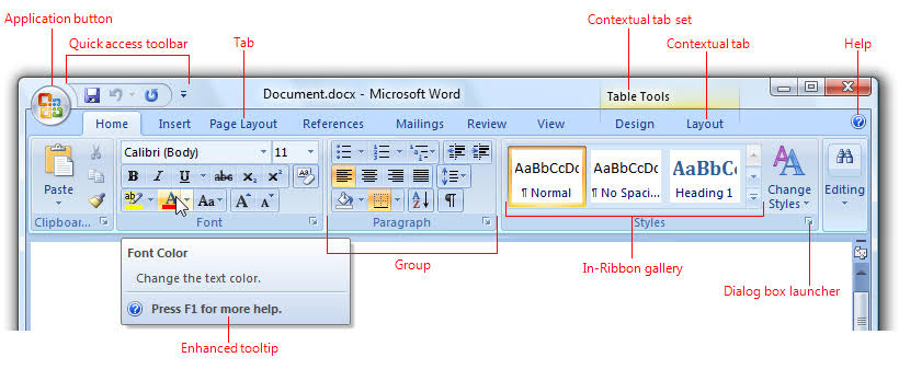
The Ribbon aimed to solve two key problems:
Improve discoverability: By organizing features into tabs and contextual menus, the Ribbon made frequently used tools more accessible.
Simplify complexity: By hiding less-used features behind logical groupings, it reduces cognitive load for users.
But even this solution came with challenges:
Mixed reception from power users: While casual users appreciated the streamlined design, power users found the new interface disruptive, as it changed established workflows.
Limited impact on unused features: Many rarely used features remained buried within the new system, raising questions about their necessity in the first place.
Despite its shortcomings, the Ribbon interface highlighted a crucial lesson: simplifying access to features is important, but it’s equally vital to reassess whether those features should exist at all.
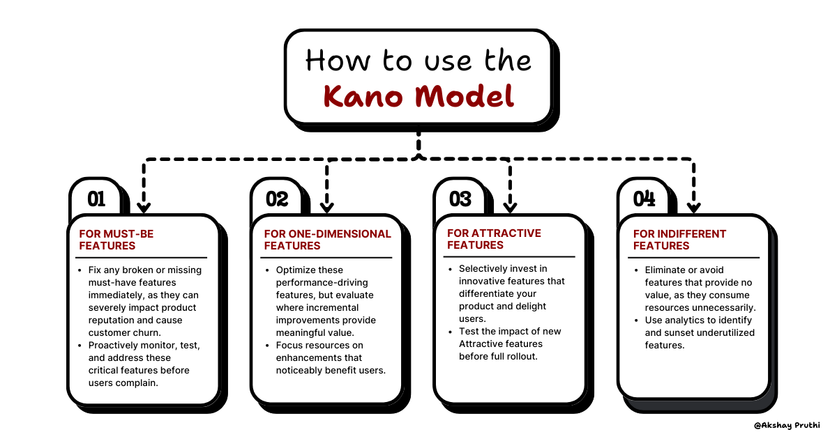
Now that we’ve explored each feature category, let’s bring it all together with a strategy to prioritize what truly matters.
How to Prioritize Features That Actually Matter💰
Alright, so we’ve explored the four types of features in the Kano Model. Now, let’s talk about what this means for your product roadmap and how to put it into action. Think of this as your step-by-step guide to cutting through the noise, focusing your resources, and designing features that actually matter. Here’s how to do it:
Step 1: Feature Classification
The first step is to ask your users two simple yet powerful questions for every feature:
How would you feel if the feature was present?
How would you feel if the feature was absent?
Let’s break this down. Say you’re building a food delivery app, and you want to evaluate a feature like real-time driver tracking. When users are asked how they’d feel if the feature was present, you might get responses like “Oh, that’s cool, I’d really like that!”. But when asked how they’d feel if it were absent, they might respond with, “I’d live without it, but it’s a nice-to-have.”
That’s an indication this feature might fall under Attractive, it’s a delight, but not essential. Now compare that to a feature like payment security. If it’s absent, users might say, “I wouldn’t use this app at all”. That’s a dead giveaway of a Must-be feature.
The beauty of this process is that it forces you to step into your user’s shoes. You’re no longer guessing what they care about - you’re listening to their honest reactions.
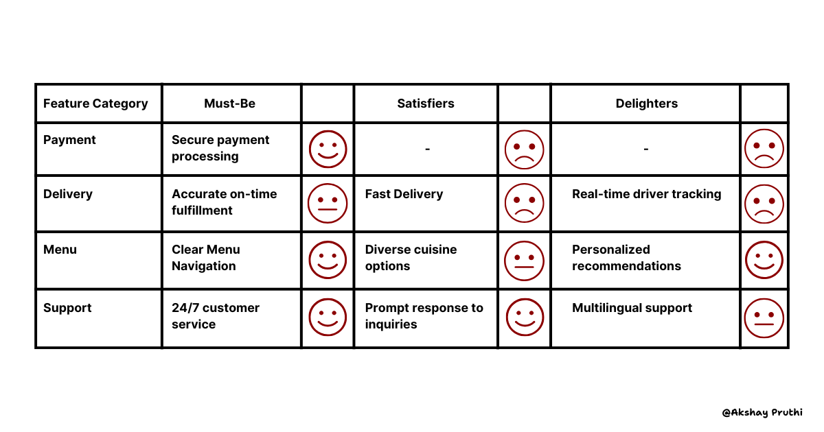
Step 2: Analysis Matrix
Once you’ve gathered user responses, it’s time to analyze them. Here’s where things get interesting. You’ll categorize the features using this matrix:
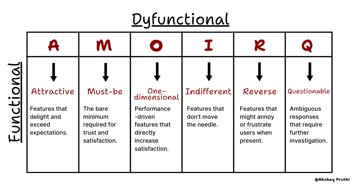
Let’s go back to our food delivery app example. You might discover that real-time driver tracking falls into the Attractive bucket, while payment security is a Must-be. Meanwhile, something like customizable app themes might land in the Indifferent category (nice idea, but does anyone actually care?).
The matrix helps you take raw feedback and translate it into actionable insights.
Step 3: Prioritization Strategy
Now comes the fun part: deciding what to do with all this information.
Here’s how to tackle each category:
So, What’s Next?
Let’s be honest: applying the Kano Model takes effort. It requires gathering user feedback, analyzing data, and making tough prioritization decisions. But here’s the thing, it’s worth it.
It’s not just about building features, it’s about building the right features.
Here’s my challenge for you:💡
Take a feature from your backlog and run it through the Kano framework. Ask those two questions, classify it, and decide whether to fix it, optimize it, invest in it, or cut it.
I’d love to hear what insights you uncover. Which features surprised you? Which ones confirmed what you already knew? And most importantly, how is this helping you build a product that truly resonates with your users?
Let’s keep this conversation going, reply to this email or connect with me to share your thoughts.